PROPOSAL TEMPLATE
PURPOSE:
The purpose of my magazine is to be educational
and entertaining by being a mix of music for the underground music of
Sheffield. It is for the teenagers of Sheffield who are 16-19 year olds. The
purpose is to inform people of new acts and encourage people to go and see
them. It helps people get into the music scene of Sheffield.
FORM AND GENRE
The genre of
magazine is music. It has different music with different styles for a wide audience. It is local music of Sheffield that makes it a
niche market and goes with the brief.
Target Audience
|
|
Ashleigh is a 17-year-old
girl who comes from an ABC1 background. Ashleigh is a girl who wears rocker
clothes and has dyed hair, she wears a lot of makeup. She is a nerd who
reads lots of books while drinking at Starbucks and she also loves Tumblr and
Star Wars. Ashleigh goes to Tramlines every year in the Peace Gardens. Ash listens
to Reverend and the Makers and Artic Monkeys which she goes to see play
gigs at places like Plug and the Leadmill. When she's not watching them live,
she listens to their music on iTunes or on Spotify. Also, she follows all
of the members on social media like Facebook, Snapchat and Instagram.
|
|
CONTENT
Front
Cover
A
front cover with my masthead at the top and the acts from one of my double page
spreads will be on the cover. The front cover will show the masthead, main
cover image and cover lines. These are all conventions of a magazine so the
audience will go for a similar formula they need so that they find a
comfortable reassurance to choose the magazine. This page
will be thicker since it needs to hold the rest of magazine. My magazine is
like Q because it has similar content and full pages which will be 21.5cm width
and 28.5cm in height.
Masthead
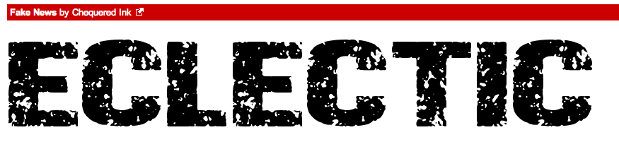
The
masthead will say “Eclectic”. The reasons it will be called “Eclectic” is
because the purpose of the magazine is to have a wide range of artists and
music styles in one magazine and the word Eclectic means diverse. The masthead
will have colours like red to connote danger to make it edgy for the target
audience of 16-19. Also, it will be san-serif font style for the masthead to
make it stand out. The masthead will look the same throughout the magazine to
create brand identity and if I wanted to make any advertising work for the
magazine it will be same. One idea for a different font styles and size for
each letter is to anchorage the meaning of “Eclectic” by the look.
Main
Cover image
It
will be the artist with the biggest following in Sheffield on the cover so that
fans of their music with pick up and read the magazines since they see that
artist as an ideal self or partner. It is going to include music styles such as
rap, indie and rock with local bands and artists. They will have a following of
16-19 years old to go with the target audience I am trying to target for the
magazine. The artist will have a medium close so that you can clearly see his
face and the artist will have direct gaze with the audience so that the
audience can connect.
The
band will be The SSS and I have put together a list of questions to send them
to answer for the interview. I’ve contacted them via social media and
they’ve agreed to answer my questions. The SSS will
wear jeans and t-shirts to go with the styles of band and most of what boys
wear in my target audience.
Cover
line
The
main cover line will anchor the main cover image. The cover line will be
gripping, this is so that the audience will be gripped and really want to read
more. Also, there will be cover line of the articles featured such as “Top ten
gig places in Sheffield” or “This week’s top ten: the best unknown bands”. The
text will be smaller than the main cover line since it won’t have gripped
people’s first attention. That will be made when they look at the rest of
the cover and be more gripped. The text will be in the house colours of the
magazine which I like
and will be like red and black. This is to create a brand identity with the
colours so it can be recognised easily and these colours will also be on the
any promotional material I create. The red and blue are to a mixture of
contrast red being like for fire and this connotes danger. This is supposed to
reinstate the fact that the idea of the magazine being a diverse
magazine. Also, the colours go with the local brief of being a Sheffield
brand since the colour red is for Sheffield United which is a local football
team.
Content
page
The
content page will have a double page.
Page one
One
page will have writing in two columns. The writing will be the articles in red
and black alternating as sub headings. The text background will be white since
most people read text black writing on a white background because this makes it
easy for the audience to read. Under the subheading, the writing with be a
sentence or two giving summaries of the articles and the page numbers next to
it. This makes it easier for the audience to navigate the magazine. The columns
will have a small gutter to space out the writing so that the audience can
easily read the writing without getting confused. The audience will use it to
find the articles that they wanted easier.
Page two
The
other page will have another picture and this will deal with another article that
isn’t the main cover image so that make the reader want to read the magazine
rather than just the main article. The image will be a medium long shot that
has the band playing a gig. This will show the audience what they do at a gig.
In the shot, one third of the photo have a group of people watching the
performances which be done over shoulder shot. Under the photo with have a text
box with the band’s name the article and page number with a photographer’s name
which will be mine name. The text box gives the reader the details of the image
and it creates anchorage which helps the audience.
RESOURCES AND PERSONNEL
I
will be the editor, photographer, and graphic designer for the magazine. I will
use hardware and software.
I
will use hardware such as pen, paper computer.
Pen
and Paper for visualisation diagram of magazine and paper for the magazine. The
paper I use will be different types for example shiny thick paper for the font
and the back of magazine which be a different of the rest of the paper. Computer
will be use for the photoshop and InDesign. A Canon 650 DSLR camera to take
photos of the acts. Phone to contact the acts.
Also,
I need software Adobe photoshop, Adobe InDesign and the Microsoft word. Photoshop
to edit the photos the photos for both on font cover and in the magazine.
InDesign to create the masthead and plug and logos. Microsoft Word to write the
magazine. The models I will use
will reflect the target audience.
DISTRIBUTION AND
MARKETING METHODS
My magazine will be online as well as print
based. This will be a synergy by branding since the magazine will have articles
on the magazine but will more information on the website since that update
weekly with gigs. The reasons for this is that print is more
expensive and only about 1000 circulation for the normal monthly magazine. It
will normally be distributed at local coffee shops such as Tabby Teas
and Oakbrook Café. However, for festivals like Tramlines
more than 3,000 copies circulation since they’d be a bigger readership because
people come to Sheffield for this. I would also print more copies during
“freshers’ week” in September since that is a way to bring in new readers for
the magazine since they are the target audience and won’t know Sheffield yet. The online site will be up to date and have
social media. The social media would be another marketing tool since on social
media can tweet out gigs and the places they’re held because this is the way to
connect with the target audience since the target audience are digital natives
and use social media a lot.
The trim of page is where the page for bleed
should be 3 mm. Safe Zone should be same as trim. Page sizes would be similar
to Q magazine since this is the style of music magazine I want to create. The measurements
are given below are also from Q. Most music magazines have the similar sizes to give the reader a lot to read and look filmier like also standing out.
21.5cm across and 28.5cm
down
21.5cm across and 14.5cm
down
9.5cm across and 13cm down
Adverting rate that
normal rates for
a local magazine that is well
established:
This is Exposed magazine
adverting rates; Exposed
magazine is a local magazine that has been well establish and
has a higher readership. This rate would
be higher than mine since the magazine isn’t hasn’t been done before and has no background on how many people will read it so it a less know to people so it not got the readership to help the averter know if the predict outcome of readers would be accurate. Therefore my adverting cost would be lower to while I build up my readership at the beginning so that I can still make the money from adverting. It will increases as the readership does.The highest page
back cover wouldn’t more than £500. The lowest price would be £50 for the
quarter page.


