I have 5 styles made for my masthead I will further being editing my chosen masthead.

This is the masthead that I chose since it is has different fonts and lettering. This is the look of the fonts style and the lettering size however it will be coloured will be red from my house style colours. This is to merge into each other to not to take up space on the other page in the magazine so that it has unity. The fonts will change and be edited. This will also be place a bit better will the and first to be big size. I have got rid of the white background and am going to change the spacing.
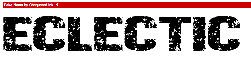
Idea 4


This font is arty splash and I might use my two Housestyle colours. This is a good typeface because it is san serif, which would make it conform to the conventions of magazine typefaces, since it would be need to be seen on the shelf.
Front page

Content page

Double Page Spread

Double Page Spread

No comments:
Post a Comment