Monday, 24 April 2017
LO4: Client and focus group feedback
This shows the focus group was based around my target audience.
This shows that it was mainly females taking this survey. This is good because my target audience is female
This shows that the magazine receives an average rating of 4.25 out of 5.
This shows people liked the band interview, masthead, pictures and the information in the magazine.
The only negative comments from the survey is that the photo's should be dispersed throughout the magazine and that the text should be broken up from the large books.
This shows that it was mainly females taking this survey. This is good because my target audience is female
This shows that the magazine receives an average rating of 4.25 out of 5.
This shows people liked the band interview, masthead, pictures and the information in the magazine.
The only negative comments from the survey is that the photo's should be dispersed throughout the magazine and that the text should be broken up from the large books.
The feedback show that my strength are the band interview, masthead, pictures and the information in the magazine. The only suggested improvements are increasing the interviews, to spread out the photos so that it look more space out and breaks up the texts so it doesn't become a book and to straighten out the social media line.
This is improvement that my client of SPH Publishing. The Publishing company said that my strong points are photography and the masthead and my interview. The Publishing company has also told me to add Headline to introduce the article and add main headline coverline. As well editing the columns size for my DPS.
LO4: Evidence of Editing
CONTENT PAGE
My editor didn't like my first attempt at a cover page because the picture had the band facing away from each other. Also the layout was the best because it need to work with the column. She also didn't like the column spacing is too small. She suggested I move the boxes that had the photos in to one side and add the text down the other side.
I did this and I added the social media logos in black at the bottom. My editor then said the social media logos need to be in their original colours. I've added more photos and text and I've also added my masthead at the top. The layout in the final was best since it had columns and space which make it better for the reader.
The first picture is the blank piece of paper and the second one has my plan of where everything is going to go. The third picture is where the test the of article was added. The fourth picture is where the questions were changed from black to red text. In the fifth picture, I moved the text around so that I could incorporate the name of the band and the photograph. These appear in the sixth and final picture. I wasn't able to add more photographs because it interfered with the formatting and I also think adding more pictures would take attention away from the words and the words of the article are more important.
This is my cover page. It has my masthead on it and a photograph of the lead singer of Calling Angels. It also has a list of the other bands appearing in the magazine. I resized the photograph and cropped it to get rid some of the background and extra people.I use the Texts box to get the writing.
LO4:Subediting
This is sub-editing work of the interview for my work by a peer.
For my next draft I need to add an introduction and I need to write more and need to make the fact that it is a music magazine more clear.
LO4: Evidence of editing part 2
CONTENT PAGE
Show the 3 Different Content page and why the change
It didn't look right.
My editor didn't like it.

It didn't show a clear magazine copy.
It was messy and big.
There weren't any columns.
My editor wanted me to change it.
For my contents page, my editor asked me to change the masthead into its original colours. I have to make the text the same size. I also had to change the colours of the social media logos so that they were their original brand colours and not black.
Dps

Here I have added the masthead
Here I have added the logo of the headline band
Show the 3 Different Content page and why the change
Content page one
The image wasn't good and the quality picture wasn't good enough for that paper size.It didn't look right.
My editor didn't like it.
Content Page 2

It didn't show a clear magazine copy.
It was messy and big.
There weren't any columns.
My editor wanted me to change it.
Content page 3
For my contents page, my editor asked me to change the masthead into its original colours. I have to make the text the same size. I also had to change the colours of the social media logos so that they were their original brand colours and not black.
Dps
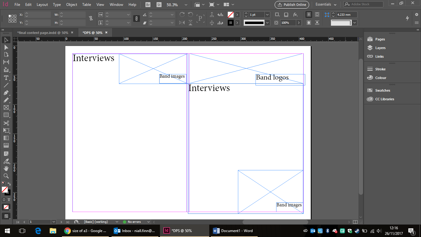
The first picture is the blank piece of paper and the second one has my plan of where everything is going to go. The third picture is where the test the of article was added. The fourth picture is where the questions were changed from black to red text. In the fifth picture, I moved the text around so that I could incorporate the name of the band and the photograph. These appear in the sixth and final picture. I wasn't able to add more photographs because it interfered with the formatting and I also think adding more pictures would take attention away from the words and the words of the article are more important.
Front Cover

This is my cover page. It has my masthead on it and a photograph of the lead singer of Calling Angels. It also has a list of the other bands appearing in the magazine. I resized the photograph and cropped it to get rid some of the background and extra people.
I started by putting in text in place of the masthead and a list of bands so that I could move them around to get an idea of what the front cover
will look like before adding the actual masthead and the band list.
I moved the place ins around until I was happy with how they
looked and then left them in place, so I could insert the actual masthead and
list of bandsHere I have added the masthead
Here I have added the logo of the headline band
Here I have added a list of the bands that will be
highlighted in the magazine
LO4:Review of assets
Final Masthead

This is the final design of my Masthead. I asked people about which font they liked and chose the most popular one. Then I changed the colours of black and red since they are my Housestyle colours. I wanted to use red because it's a bold colour and it stands out. I added bit of black using the gradient tool so we added to the effects of the font.
Magazine
The strengths of my contents page are the photographs of the bands and the fact that it's easy to see where the features and regular pieces are. This fit my genre because I am going it my indie band section and the black and white is typical thing indie band do like 1975. This is fit with my brief of being local.
The weaknesses are that I could've edited the page more and mixed some of the photos between colour and black and white shots and I could've made it brighter
Subscribe to:
Posts (Atom)