CONTENT PAGE


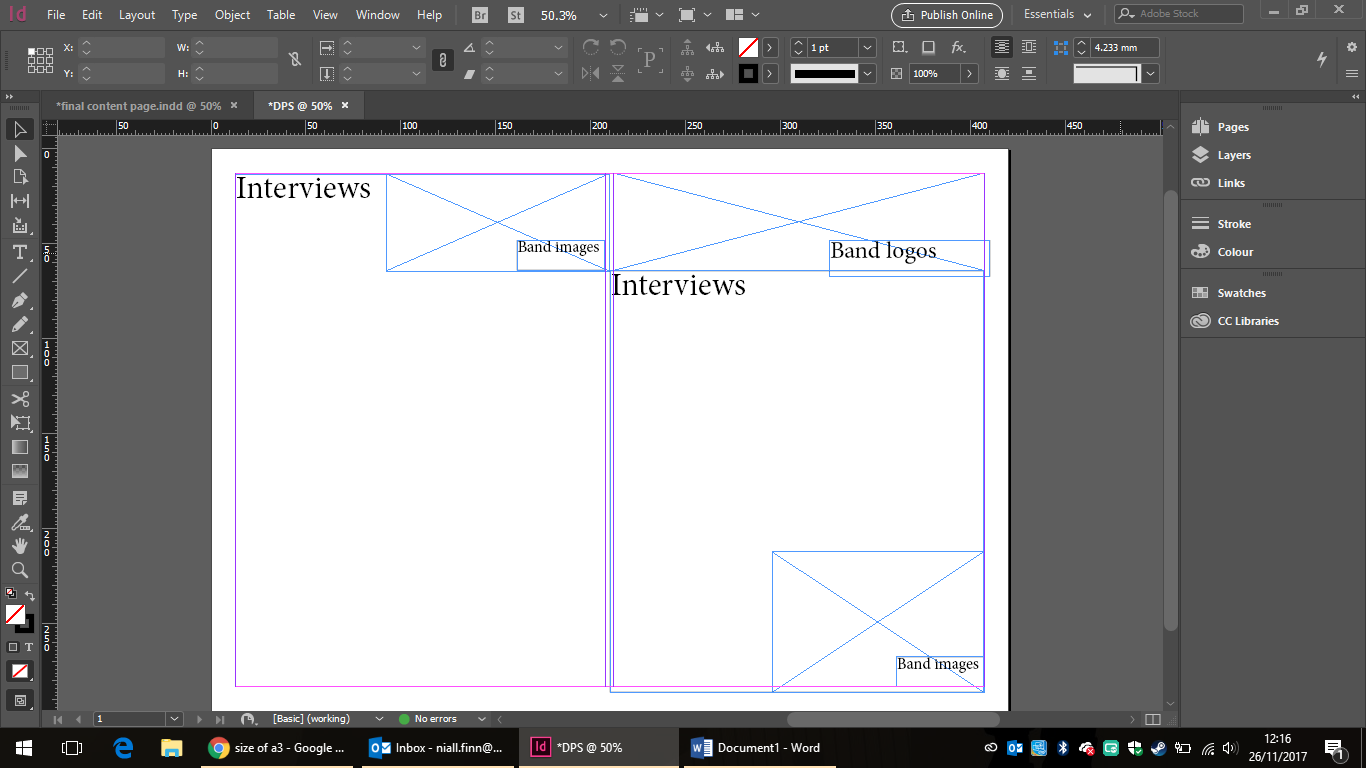
My editor didn't like my first attempt at a cover page because the picture had the band facing away from each other. Also the layout was the best because it need to work with the column. She also didn't like the column spacing is too small. She suggested I move the boxes that had the photos in to one side and add the text down the other side.
I did this and I added the social media logos in black at the bottom. My editor then said the social media logos need to be in their original colours. I've added more photos and text and I've also added my masthead at the top. The layout in the final was best since it had columns and space which make it better for the reader.


The first picture is the blank piece of paper and the second one has my plan of where everything is going to go. The third picture is where the test the of article was added. The fourth picture is where the questions were changed from black to red text. In the fifth picture, I moved the text around so that I could incorporate the name of the band and the photograph. These appear in the sixth and final picture. I wasn't able to add more photographs because it interfered with the formatting and I also think adding more pictures would take attention away from the words and the words of the article are more important.

This is my cover page. It has my masthead on it and a photograph of the lead singer of Calling Angels. It also has a list of the other bands appearing in the magazine. I resized the photograph and cropped it to get rid some of the background and extra people.I use the Texts box to get the writing.
No comments:
Post a Comment