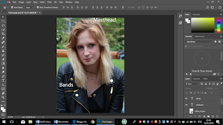
This came be improve with boxes on the letters. There aren't any graphics or slugs with are convection that I should have included in my magazine. The best part of my magazine is the main cover image since it has the audience gaze as well as giving the audience ideal self/partner. This is a best because my image is of a female which a lot of magazine have males on the cover so it show female empowerment. This image is great because the artist isn't being sexualise which lots of magazine do.
This could be improve with straightening out of the social media and the text boxes of the titles to be the same so it looks more standard in the layout. I think the best is images because it nice look in the DPS.
This Magazine page could be improved by less writing and more picture so they are break in the writing. This could may be improve if I use a back ground image and had the writing on the image.
Some of the best parts of my magazine page are images of black and white since it look indie which it show the band genre of music. The interviewer colours on the writing so it clear show who saying what.


